
A bold look for a unique company.
Zeit is a fictional company offering time travel tours. This project was challenging because time travel doesn't (yet!) exist. Otherwise, the service I was designing for was essentially a travel or tour company. The research was centered around travel and touring, and how users book and browse for these service.
Adventurous travellers interested in a unique and immersive travel experiences. Risk takers and trendsetters who like to try new things.
This was a speculative project for a fictional company, and part of coursework for DesignLab.
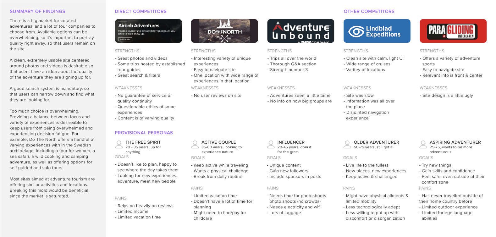
There is a big market for curated adventures, and a lot of tour companies to choose from. Available options can be overwhelming. It’s important to portray quality right away, so that users remain on the site. A good search system is mandatory, so that users can narrow down and find what they are looking for.
Too much choice is overwhelming. Providing a balance between focus and variety of experiences is desirable to keep users from being overwhelmed and experiencing decision fatigue. For example, Do The North offers a handful of varying experiences with in the Swedish archipelago, including a tour for women, a sea safari, a wild cooking and camping adventure, as well as offering options for self guided and solo tours. Most sites aimed at adventure tourism are offering similar activities and locations. Breaking this mold would be beneficial, since the market is saturated.
Three people ages 35-67 were interviewed about their travel habits. I asked questions about how they like to travel, the kinds of experiences they seek out, the things they find uncomfortable while travelling, and their most memorable or unique travel experience.
Users are looking for unique experiences that help them feel more connected to the greater world community. When traveling people are interested in being involved in the localculture as experienced in daily life, not just seeing as many places as possible. Today’s world doesn’t allow for much change, and people seek that out more often when travelling. People feel discomfort around being forced into small spaces in large crowds, or when they feel a loss of control over their autonomy.
By offering unique and flexible travel experiences that allow people to be fully immersed in culture while providing opportunities for chance encounters, Zeit can have a competitive advantage in the travel industry. User reviews and photos are important in instilling a sense of trust and reliability. Read the full research report here.
Empathising with the user begins with building a cohesive user persona. This persona was developed out of the user interviews conducted.

The story board helps build a context around the user to give them a deeper history. It helps designers understand motivations and environment of potential users better, so our designs are rooted in empathy.
This story board imagines that a teacher wants to communicate better with some of her students' parents. She decides to travel during her summer break to learn K'iche. She uses Zeit to book a unique tour.

This task flow sketches out the navigation and looks at how users will arrive at the call to action : booking travel.

This user flows explain how Julianna, our user, will search and come to the decision to book her travel.

Because Zeit is offering bold and experimental tours, they needed bold branding that had a touch of luxury. I chose a rich deep blue and red for the logo. The imagery was saturated with an experimental feel to it. It was also important to keep the logo simple to communicate how easy the booking process could be. For this reason I chose a wordmark and a simple geometric logo.

I began wireframing for three devices : desktop, tablet, and mobile to ensure that the site would be fully responsive. From the beginning I started designing the search feature, since that would be a really important way people navigate the site.

The UI kit carries out the strong, bold branding. This kit shows some elements across all three devices.

The high fidelity wireframes are image driven with easy search function. The navigation was kept simple with many options on the homepage to filter and browse. Images are bold and large to give people a quick feel for the tours.


Usability testing was conducted with three people - one over videoconference and two in person. They were: a UX student and creative director, a German teacher, and a software engineer.

Initially, designing for a service as outlandish as time travel was challenging. I treated this like a travel site, and focused my attention on perfecting the search function and site navigation. I learned a lot about the UX process in this project.


