Supporting holistic women’s health with cycle tracking.


When this project started, the client was in the beginning stages of building her business. She had a concept for what she wanted to provide to the public, and together we worked to develop the name, branding, content writing, marketing strategy and infographics, and design a fully responsive website. Based on what we created, she has been able to successfully implement seamlessly use the branding system on social media, as well as fully implement the site herself with Squarespace.
One of the trickiest aspects of this project was the information architecture. The client needed to educate as well as promote her services. She also needed to clarify the difference between the system she teaches and her own brand. We did multiple rounds of testing to ensure the information was clear and the site was easy to navigate.
Women and couples looking to either achieve or
avoid pregnancy, with an interest in better
understanding their monthly cycle.
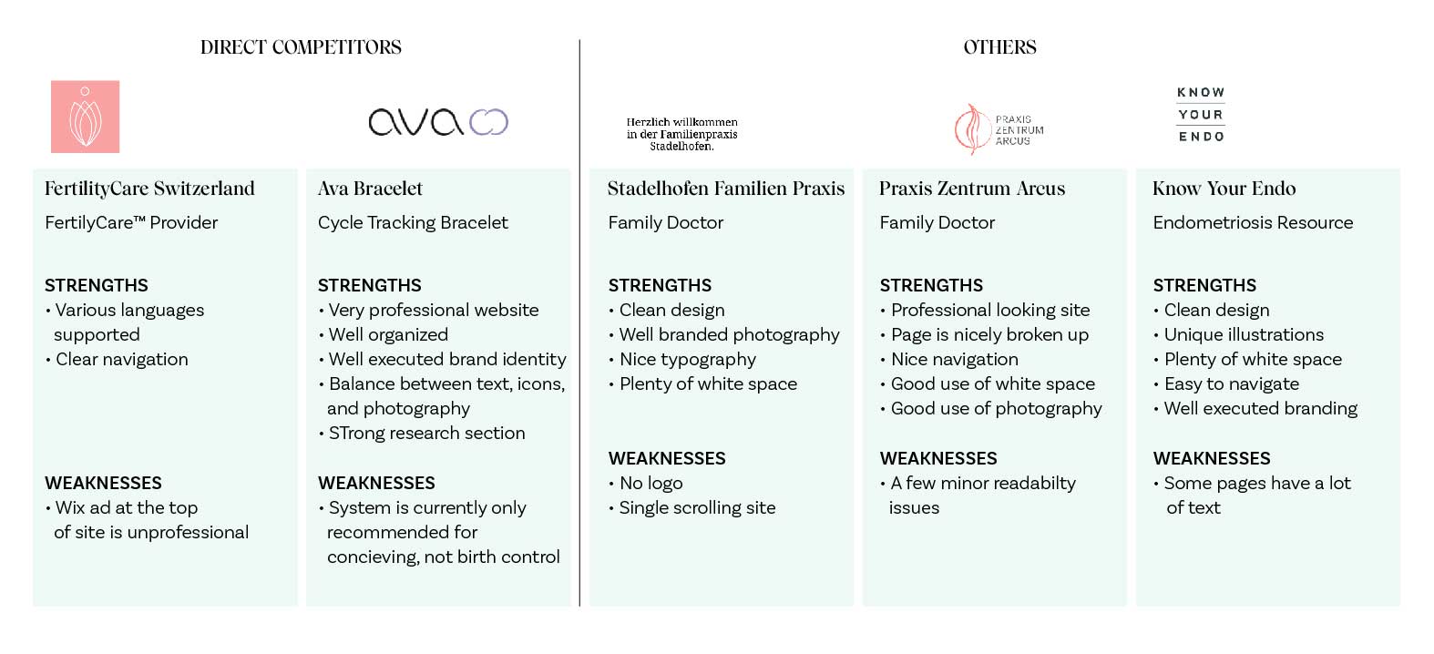
For the competitive analysis, we looked at direct competitors as well as adjacent businesses that are somewhat related, such as the Ava tracking bracelet, which is supposed to track fertility for conception. We also looked at the design of sites the client liked which provided a good example of resource and education sharing, such as Know Your Endo.

The other FertilyCare™ practitioners in Europe have basic, somewhat unprofessional sites and little to no branding. There is definitely a lot of room for improvement. The brand Ava, which has a cycle tracking wearable used to achieve pregnancy, had the most professional looking site. Another nice example was Stadelhofen Familien Praxis. Their site was clean, with coherently branded photography and nice typography on their site. The best in the category of women’s health was Know Your Endo. The site was clean with unique illustrations which set it apart from other sites with similar content. Based on these findings, we wanted a warm but clean and professional site. Since the FertilityCare system is not well known in Zurich, it was important the the topic was approachable and the science was presented well.
The FertilityCare system could be applicable to any sexually active heterosexual couple, and any woman interested in learning more about her cycle. Consequently the target demographic covered a broad range of users. We developed three users personas that covered this broad range.
The site map was developed before the content was finalised. From the beginning, we knew we wanted an informative yet engaging landing page that could get information across quickly and simply, as well as allow an interested user to dive in. We also knew that the site would be content heavy with some complex or new ideas, so the navigation and information architecture needed to be well executed.
The user flow was fairly simple, since the offering of the site was mostly to educate. The call to action was to get users to contact Bloom for a consultation. We hypothesised users would wander through the site gathering information until they decided whether they were interested and ready to commit.
The client decided to go with the name Bloom, to which we added the words Cycle Care to avoid confusion with florists. The concept related in a lovely way to how the FertilityCare system could be used throughout a woman’s life, as she blossomed into different roles and went through changes in her body. It was important to keep the brand identity simple and let the illustrations and infographics do the heavy lifting visually. We chose an elegant and clean sans serif for body text and a more decorative serif for the word mark and the headline text.

The icons and infographics are where the brand identity comes out to play. We wanted an approachable and professional feeling, since people will be trusting their health and private issues with Bloom. Because the site would have so much content, it was important to have easily digestible visuals throughout the site to keep people from bouncing off the site. I created a set of infographics and icons for Bloom to help explain complex concepts and keep the page lively.

The wireframe process started with pencil sketches to quickly get out many ideas and work out any issues before getting on the computer.
Since the content was developed during the UX design process, the low fidelity wireframes sketched out the type of content needed. We also identified the which infographics would need to be designed and where they would go, ensuring that the page had a nice rhythm and balance between content and visuals. We began prototyping in the low fidelity stage to test usability and the information architecture.
Mobile wireframes were developed alongside the desktop version to make sure the design was responsive.

We used both in person as well as remote usability testing using a prototype link and a survey that guided users with open ended questions and responses. Testers were all female. Some were familiar with FertilityCare and some were not. We used testing to make sure the information was easy to understand.
During testing we realised that people were confused about the difference between Bloom and the system that Bloom teaches. We needed to remedy this right away. Testing also showed that people wanted a more personal connection to Bloom, so we added in a photo and a contact section in other parts of the website.


The most interesting challenge of this project was ensuring that the information architecture and content was clear to users who are completely unfamiliar with the organisation and the FertilityCare system. What made it a little difficult was that the copy was developed alongside the design process. This meant that some things needed to be redesigned or shifted throughout the process. It also meant that I was able to participate significantly in writing copy, utilising my marketing background and writing skills to make the content and architecture easier to understand.